The accidental maximalist: Or, what’s so minimal about minimal editions?
Abstract
Minimal editions have become popular because they answer the problem of curating texts under a set of constraints. However, encoding and publication workflows, even for minimal editions, run the risk of becoming bloated if the editor loses sight of the project’s priorities. Over a project’s life cycle, it is normal that these priorities will shift under the pressure of this or that constraint or challenge. Several authors have noted that minimal computing stacks displace complexity away from users and onto the editor or technical partner (Dombrowski 2022; Giannetti 2019; Hughes 2016). Identifying the necessary technical complexity is rarely easy. I focus on the latter two of Risam and Gil’s four-question heuristic for minimal computing—“what must we prioritize?”; and “what are we willing to give up?”—in order to demonstrate the importance of reengaging with these questions as new challenges come to light (Risam and Gil 2022).
With the Personal Correspondence from the Rutgers College War Service Bureau, I initially made choices consonant with a minimal approach. The edition navigation replicated the file structure of the archival collection, organized by the name of the alumnus serving in World War I. The project schema exhibited straightforward choices regarding the encoding of people, places, and events. However, the plan to capture biographical information on each Rutgers person mentioned nearly ran aground when a single soldier mentioned fifty classmates in his letters. A desire for a more enriching reader experience led to a choice to provide subject access to the letters, which in turn brought classification and UI difficulties. In this case study, I provide substance to the hard decisions editors face amidst evolving priorities and the need to curtail some plans. Documentation of best practices in this area will serve other editors who must make pragmatic choices in the service of local knowledge production.
Short Paper
Note: You may find my slides here, although I have replicated most visual supports below.
What is a minimal edition? It might mean more than one thing at a time. For some, it will mean a digital edition built using a minimal computing approach, by which I mean editorial projects that focus on necessities and reduce technological and resource dependencies. For others, a minimal edition will denote an editorial approach, with the goal of creating something like a reading edition of a text, which is to say a singular text, possibly accompanied by explanatory notes (Vanhoutte 2009). In yet a third case, a minimal edition could mean both things at the same time. This is the definition I am using to describe my approach to an online pedagogical edition: the Personal Correspondence from the Rutgers College War Service Bureau. Using a four-question heuristic proposed by Alex Gil and Roopika Risam as a launching point, I will take us on a project management tour through wants, needs, uncertainties, challenges, and some victories (Risam and Gil 2022). A minimal approach to a text can easily balloon to a maximal one when wants get in the way of outcomes. Regularly engaging with the questions—“what must we prioritize?” and “what are we willing to give up?”—has been key to pushing through various impasses. In this talk, I will describe a few of these challenges, and compare my choices to those of editors of another minimal edition. I will conclude with a few observations that I hope will assist editors facing similar challenges.
The records of the Rutgers College War Service Bureau is a collection of university records from the period of US engagement in World War I. The records include correspondence between the director and Rutgers men serving in the war. My involvement in the project began when digitization was complete; my role was to create opportunities to engage student researchers with the digitized materials. Given my background in text encoding, I naturally thought of a digital edition.
I will quickly dispatch with the first two questions Gil and Risam pose us. What did I need? An online edition of some sort so that students could have something to point to when they completed their work with me. What did I have? I was already aware of the Jekyll static site generator and the Ed theme for minimal editions, and it seemed natural to use it after making a handful of modifications to suit the features of correspondence. My troubles began with the second two questions, which in my experience really speak to the decision making aspects of the project plan.
As project director, I was highly motivated to learn several things myself in addition to teaching students. And I lacked the typical project management constraints that would have forced me to make binding decisions sooner. First, I have no real “client” unless it is the student encoders themselves, which switches the focus from outputs to processes. And second, this project has no funding (funders typically impose strict timelines). When I published the first letter anthologies to the web, I made a decision to replicate the structure of the archival collection itself, which is organized into files of correspondence associated with individual alumni. This structuring choice also made sense from pedagogical perspective. It is easy to assign an alumnus to one or more students so that they can spend time with a single person’s handwriting and learn more about them through archival and genealogical research. However, this choice eventually posed a challenge for online navigation, since access by alumnus name was meaningless to most readers. At an NEH institute on “Advanced Digital Editing,” I was encouraged to create wireframes for various possible interfaces. At the time, I had the institute’s chosen platform, the very much not minimal eXist-db, in mind when I drew these images, showing access by location, subject, and date. Location information struck me as important to keep, since there are many locations mentioned in the letters that are training camps throughout the US and Canada, and of course sites along or near the Western Front, and which would not be especially familiar to most readers. Consequently, part of my learning would be to extract location information from the correspDesc and listPlace elements and visualize them in an online map, preferably using open source software. I was also very attached to the idea of subject access to individual letters, which would mean breaking up my letter anthologies into individual letters classed by subject. I had no good idea of how to accomplish this without a database, which was not an option for this project.
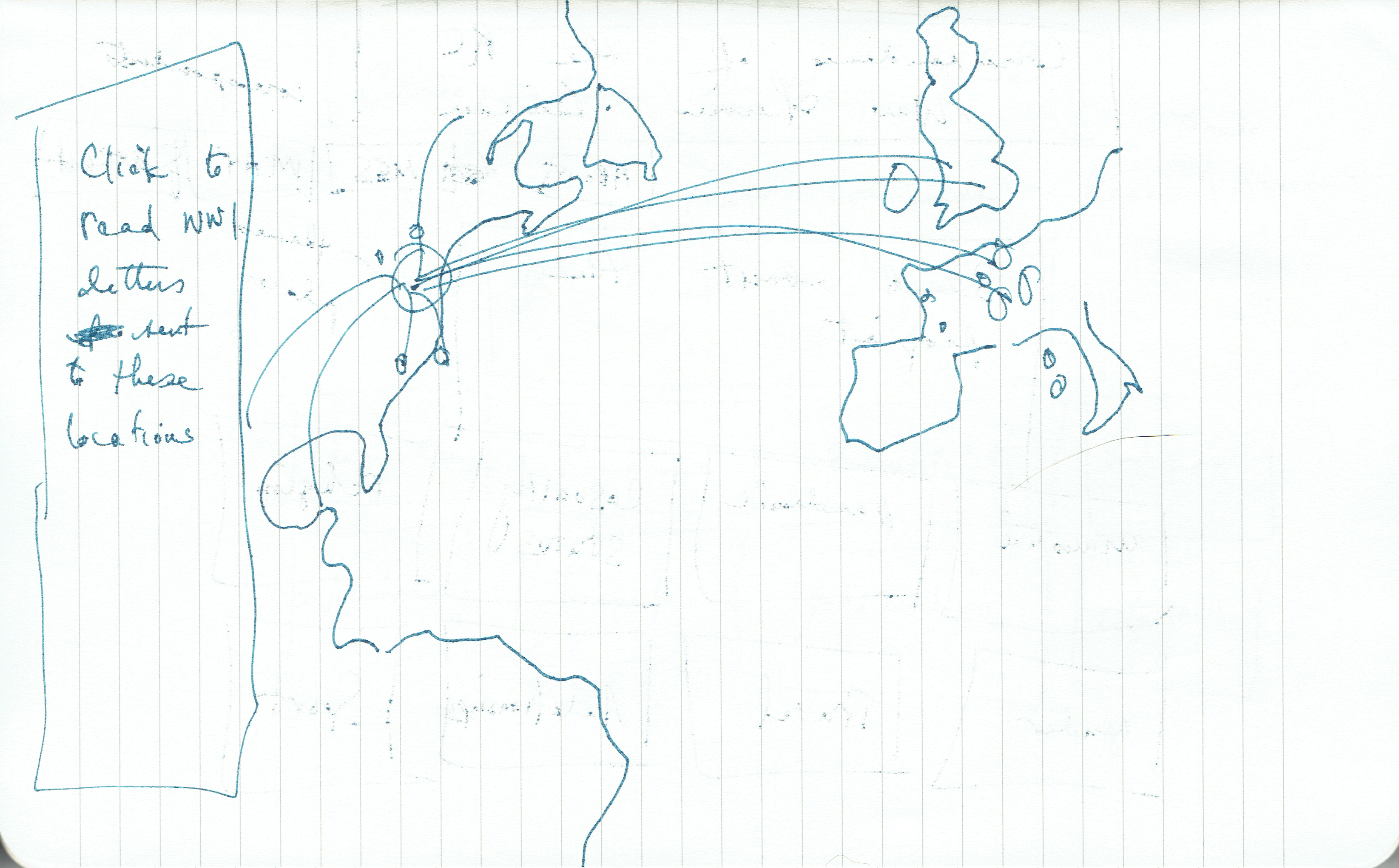
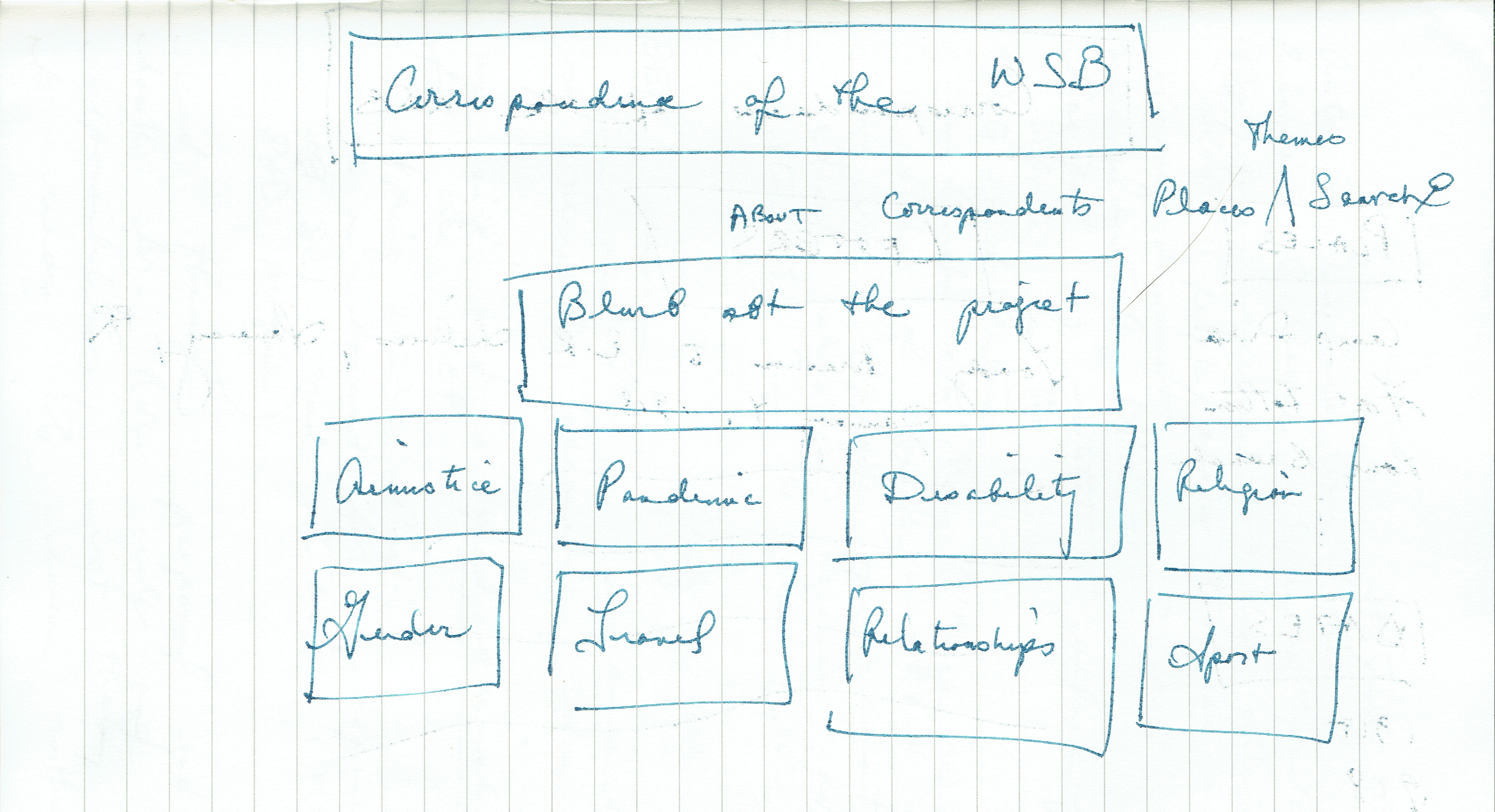
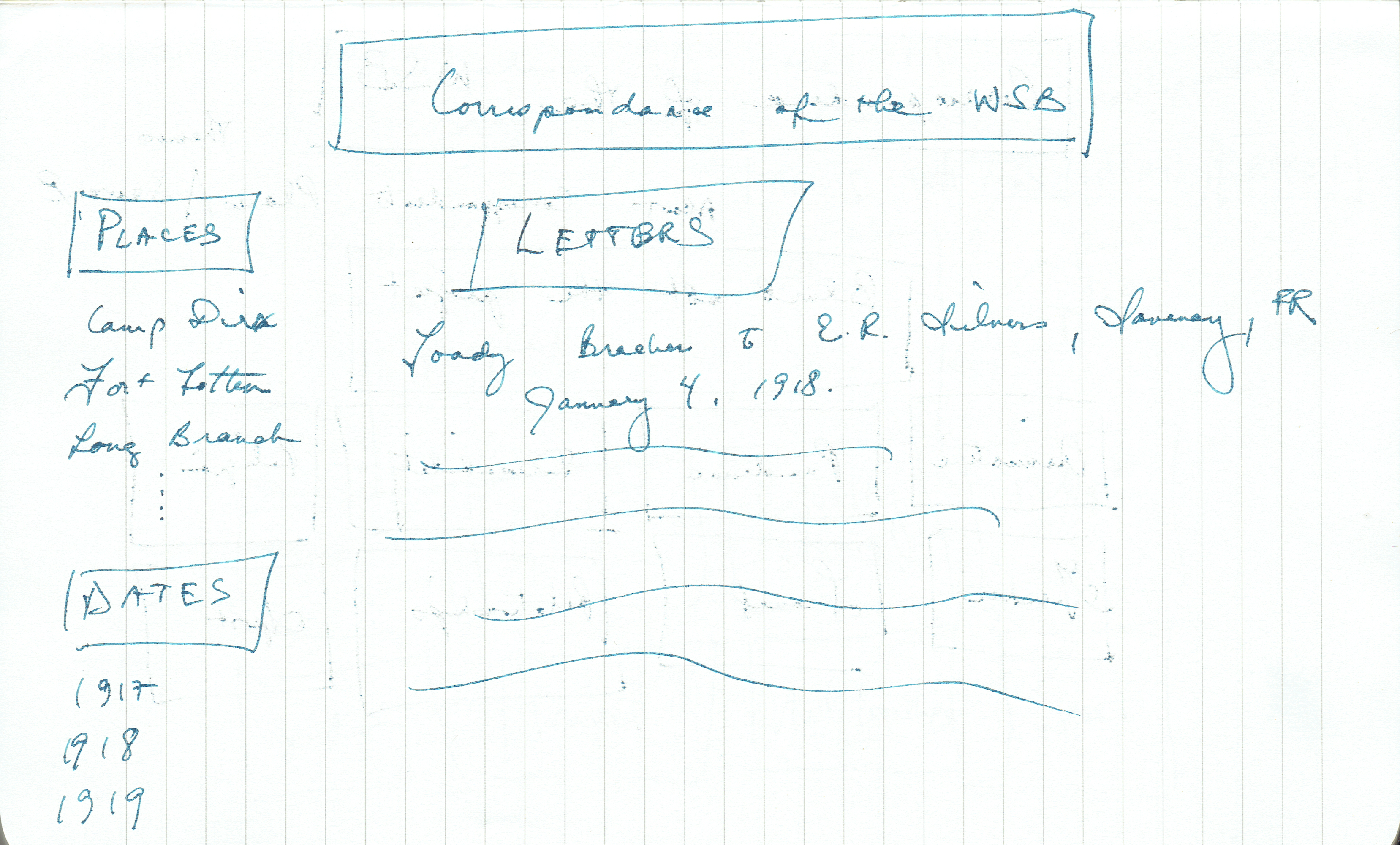
One of the felicitous aspects of my participation in that NEH institute was a realization that I had to cede some control of the edition to the student interns working with me. I did not myself have all the answers, and it was quite possible that they would have better, more actionable ideas. Madiha Maajid, an intern who was a computer science major, listened to my thoughts and hopes for subject access and my exhortation to avoid databases, and created a prototype that kept the primary access by alumnus but added secondary access by subject. This solution did not require a radical reorganization of the existing edition. She used only JavaScript, HTML, and CSS.
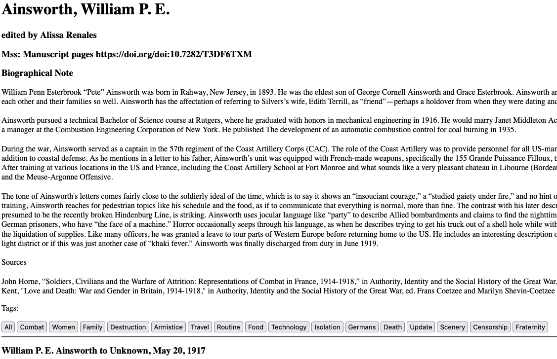
Maajid also created a more image-friendly mock-up of the interface, which I have yet to implement.
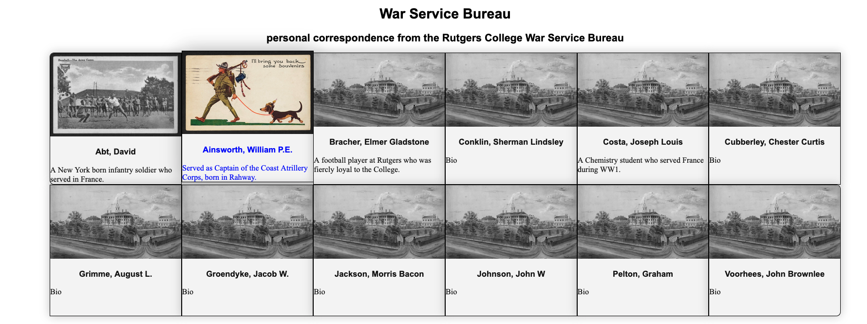
Following her lead, I gave up a location-based interface and instead added a Leaflet map only to those letter anthologies where it might enhance a reader’s understanding of the letters.
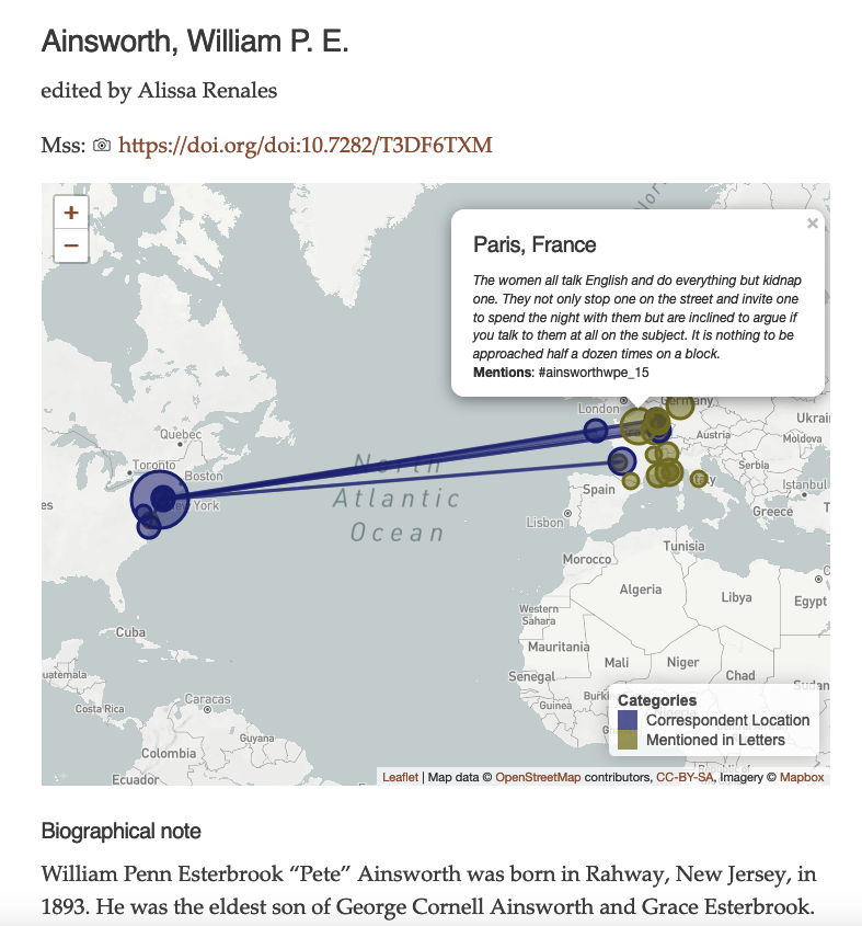
Some alumni moved about the United States, France, and elsewhere, while others stayed in the same location for their whole war; the latter men didn’t need maps.
The scope of the navigation issue, and the required technologies, seemed to be narrowing, which was progress. That left the challenge of adding subject classification to the encodings and the interface. In a first pass, the students and I use the Hypothesis annotation tool to make a preliminary assignment of subjects with links to Library of Congress authorities.
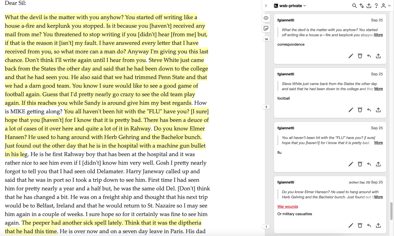
Of the many potential themes to highlight, we seek the ones that are descriptive of individuals as well as ones with the potential to carry over to other anthologies, but no more than 20 subjects per individual letter anthology. We use Hypothesis to highlight the segment of the letter that is about that subject. In a second step, we add the subjects to the encodings themselves via a keywords element in the teiHeader and within the letter divs. We are using something of a shortcut and adding the subjects to the @ana attribute inside of the opening tag of the letter div. Compare this approach to that of Kinship & Longing: Keywords for Black Louisiana.
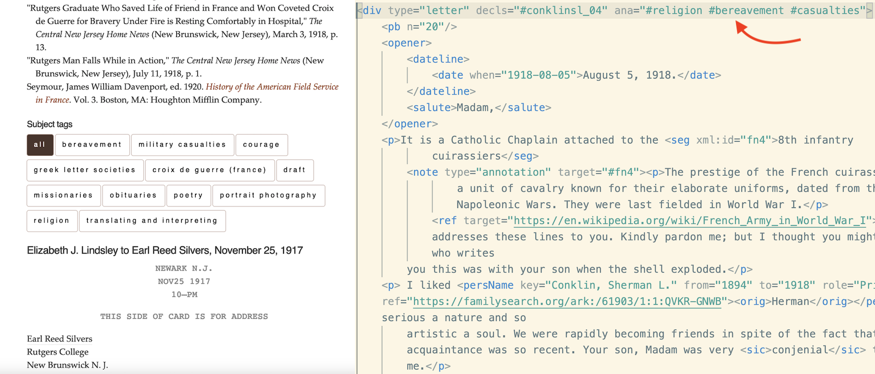
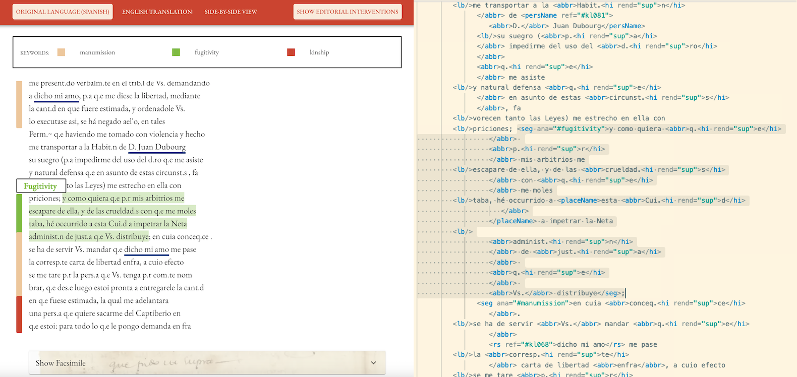
In terms of textual evidence, the Kingship & Longing approach is preferable because the editors keep their //seg/@ana encoding attached to the sentences that inspired them. Their commitment to a minimal edition is manifested in their choice of only four keywords across the documents. I couldn’t commit to so few subject terms, but I did cut a corner on the placement of the @ana attributes, which saves considerable time. On the front end, with the addition of some JavaScript, the subjects become clickable buttons that open and close the letter anthologies like an accordion, alleviating an issue of overly long web pages.
Concluding Thoughts
In comparing my idealized, eXist-db inspired wireframes to where we ended, it becomes apparent that there is tension between minimalism (editorial or computational) and a flexible user experience. Note that in the long list of minimals from the GO::DH Minimal Computing Working Group no one mentioned “minimal friction,” because there is often some user friction with minimal interfaces. Access points were eliminated because we could not support them within our constraints. The trick is perhaps finding an elegant balance between friction and user friendliness.
Minimalism as an approach felt at times like a straightjacket; it meant giving up on some of my personal learning objectives. But I also find the four-question heuristic to be seriously useful. Just because letter metadata can be visualized in all kinds of ways does not make that approach meaningful for every text. And as I eventually realized, the war theme and the focus on trauma required a respectful sobriety and simplicity, not tons of interactivity.
Finishing, at least provisionally, is important. I spent a lot of time in a deficit mindset, focusing on wants and avoiding hard choices. Being able to point to some kind of output is important for institutional validation, certainly. But it also matters for building confidence as an editor. And there is some catharsis in documenting the tradeoffs, as I have done with you today.
Works cited
Dombrowski, Quinn. 2022. “Minimizing Computing Maximizes Labor.” Digital Humanities Quarterly 16 (2). http://www.digitalhumanities.org/dhq/vol/16/2/000594/000594.html.
Giannetti, Francesca. 2019. “‘So near While Apart’: Correspondence Editions as Critical Library Pedagogy and Digital Humanities Methodology.” The Journal of Academic Librarianship 45 (5): 1–11. https://doi.org/10.1016/j.acalib.2019.05.001.
Hughes, Joel. 2016. “Minimal Definitions - Notes.” Minimal Computing (blog). October 7, 2016. http://go-dh.github.io/mincomp/thoughts/2016/10/07/minimal-definitions-notes/.
Risam, Roopika, and Alex Gil. 2022. “Introduction: The Questions of Minimal Computing.” Digital Humanities Quarterly 16 (2). https://www.digitalhumanities.org/dhq/vol/16/2/000646/000646.html.
Vanhoutte, Edward. 2009. “Every Reader His Own Bibliographer – An Absurdity?” In Text Editing, Print and the Digital World, edited by Kathryn Sutherland and Marilyn Deegan. Farnham, England: Ashgate.

Comments